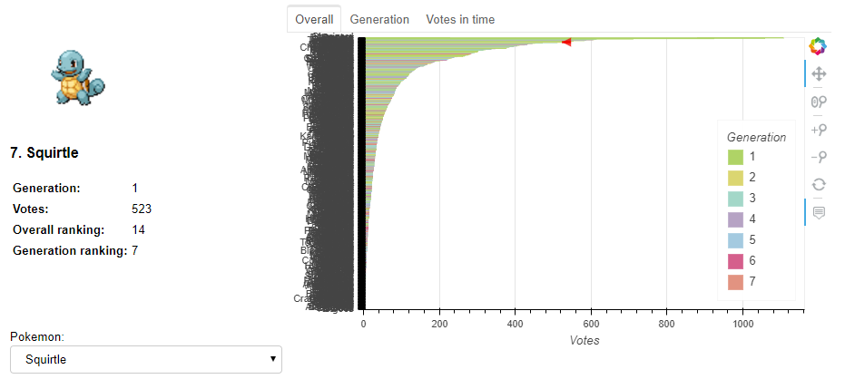

Previously, I looked into Pokémon’s popularity from all 7 generations. However, I felt the visualizations were a bit static. Furthermore, you couldn’t get details on your preferred Pokémon. Therefore, I decided to extend this project and created an interactive dashboard using Bokeh and Binder to visualize the results of the survey. It allows you to choose whatever Pokémon you want and see its preference ranking compared to all Pokémon, compared to all Pokéon of its generation, and how did people voted for it in time during the period in which the survey was open (notice how the color of that plot corresponds to the Pokémon’s dominant color)

- Find the complete Github repository here
- Find the interactive visualization here
(be patient, it can take a while to load; works best on desktop).
A big shout out to @bryevdv for helping me with a few issues I had with Bokeh legends and to @betatim and @jdkent for helping me deploying the Bokeh app in Binder. The latter isn’t so trivial. Thus I wrote a small post with the required steps to do so, which you can find here.
If you have any questions, comments, or feedback, please open a discussion. If there is a problem with the code (e.g., mistake), please open an issue. You can always drop me a line on Twitter (@amoncadatorres). Lastly, if you found this useful, fun, or just want to show your appreciation, you can always buy me a cookie. Cheers!